McDonald’s: Macca’s Brand Reset
McDonald’s has long been associated with producing overly processed food. For McDonald’s, this perception was no longer relevant or accurate and there was a need to shift public perception.
McDonald’s centred a rebrand around the word ‘Real.’ This meant re-building the brand on being honest and authentic as well as being human rather than mechanical. The brand had to be perceived to celebrate imperfection and have a soul.
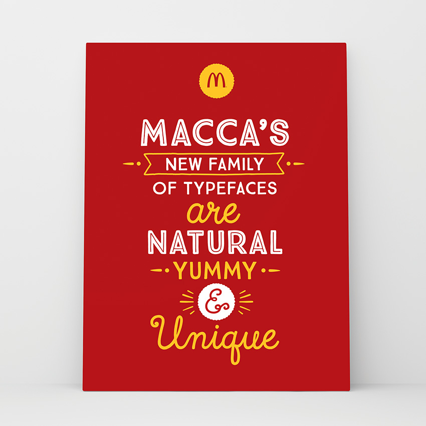
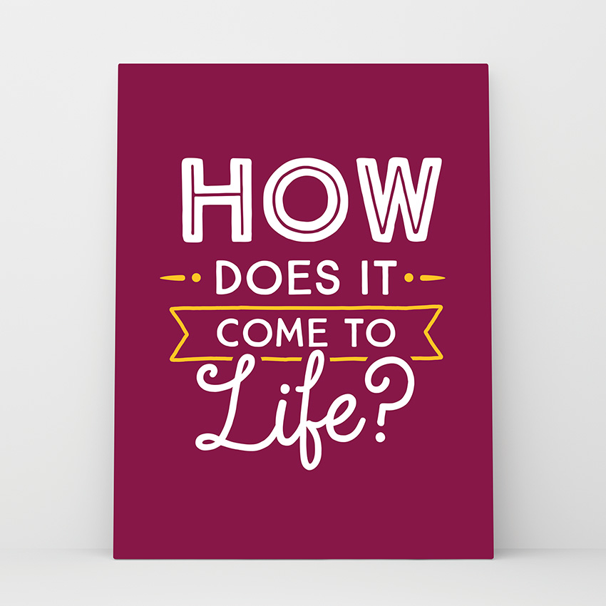
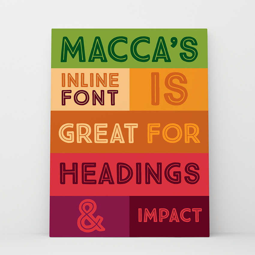
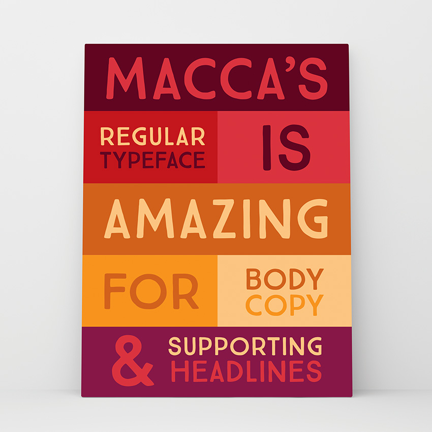
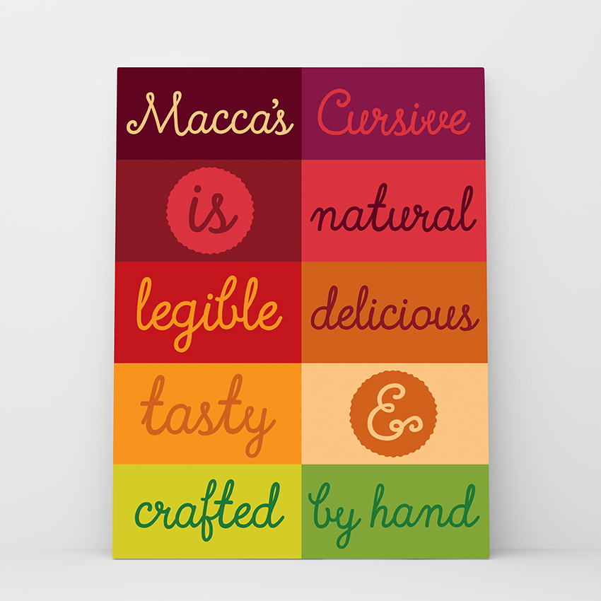
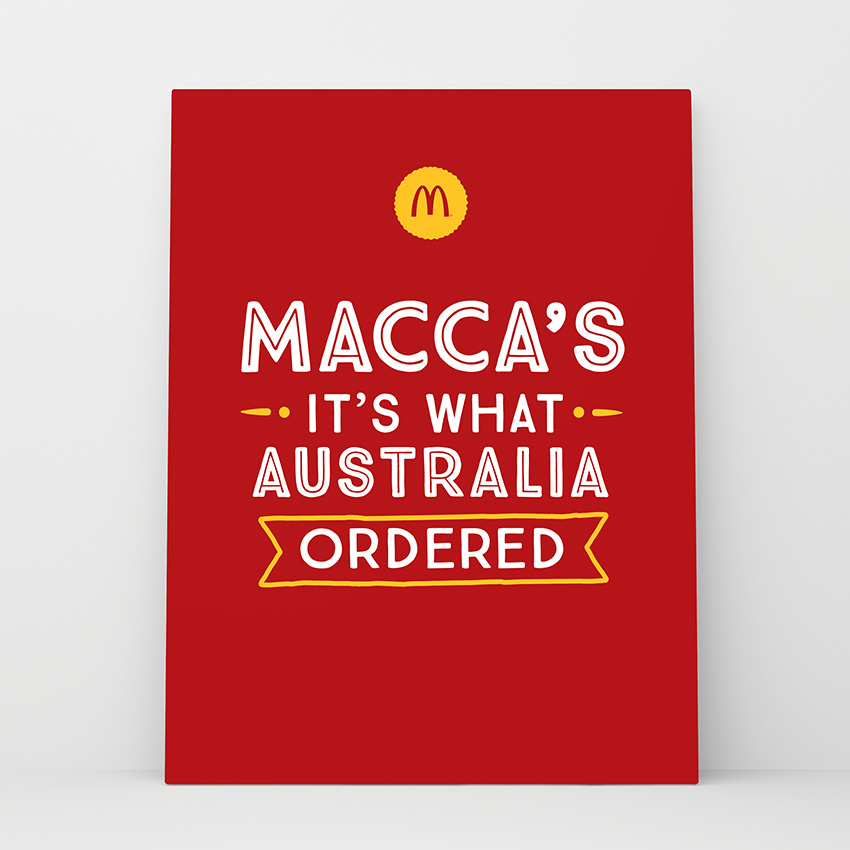
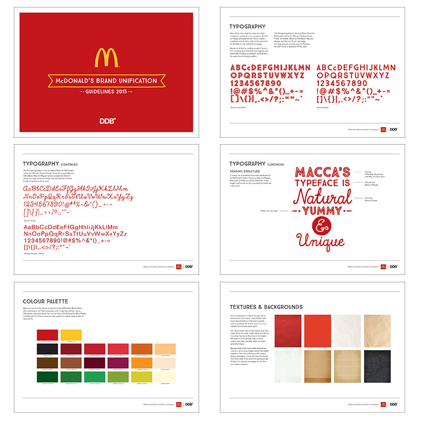
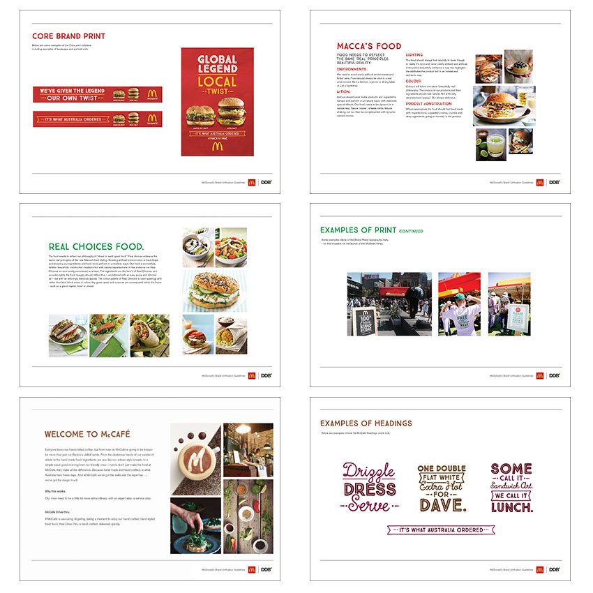
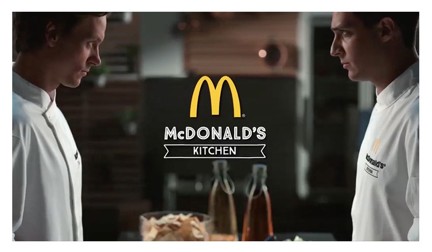
With this in mind, DDB Sydney was tasked with creating a Brand Reset for McDonald’s, including the creation of a new family of typeface named appropriately ‘Maccas.’ The typeface came in 3 different weights (Inline, Regular and Cursive) and these will be used across all various McDonald’s brand platforms. Brand guidelines were created to show how the typeface and colour palette could work with appropriately shot photography.
Chief Creative Officer: Toby Talbot
Creative Director: Cam Hoelter
Design Direction: Domenic Bartolo
Creative Teams work featured:
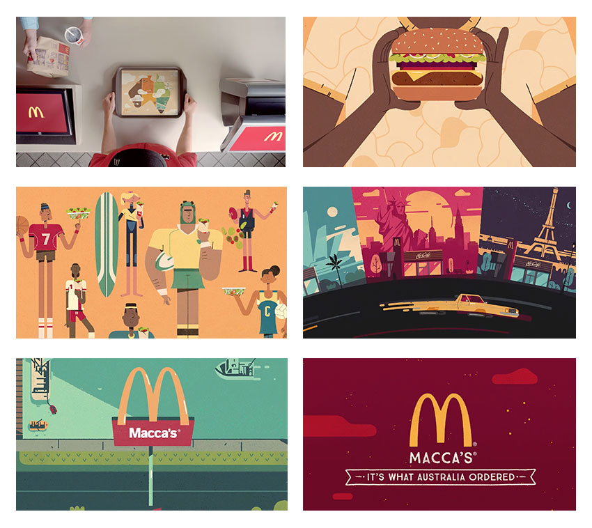
Ellie Jones & Avani Maan: ‘Traymation’
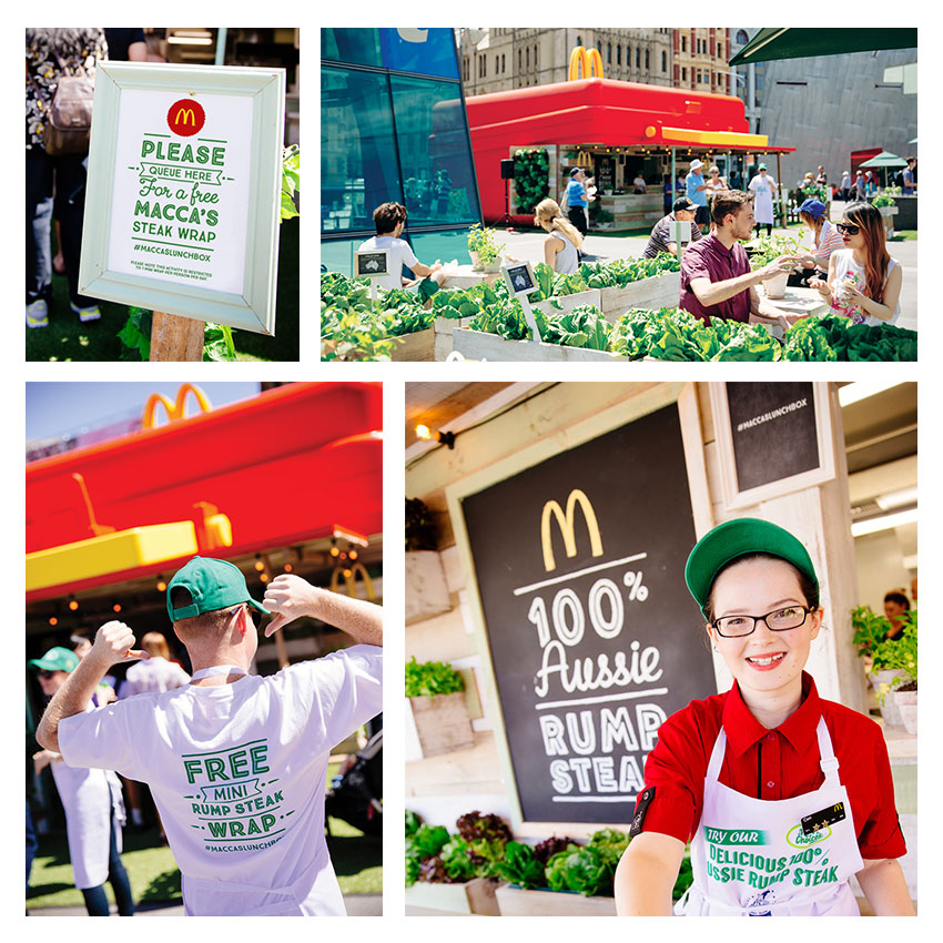
Ben Pearce & Matt Chandler: ‘Lunch Box’
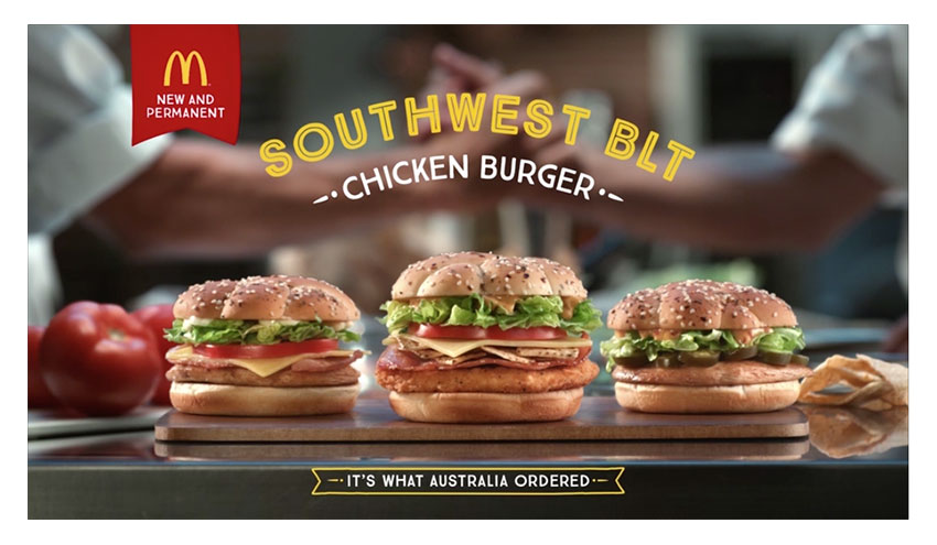
Anna Paine & Owen Bryson: ‘Southwest BLT’
© 2025 Domenic Bartolo | domenic.bartolo@gmail.com

